"I am a fan of the design however; I feel that it would look
better if features of the main character were added onto the cartoon man, such
as his large quiff and facial hair to give it a bit more of personality and
consistency."
Callum Fitzsimons - Fellow Student

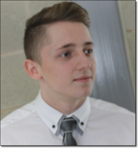
"I feel you should replace the orange man with the real life picture, as the
caricature of the stickman does not look very professional, if using the original real life photo of Conor have him featured with
something orange to maintained consistency"
Shannon Porter - Fellow Student

"The cartoon man is an effective concept with the man
attracting the viewer to look into the distance and question the content,
however, I don’t feel it connects with the rest of the production work and
therefore consistency is lacking."
Benedict Findlay - Fellow Student
This feedback is invaluable to my production work as it allows me to both understand what can be improved and how it can be improved, whilst making the product appeal to my target audience.
No comments:
Post a Comment